NOCTE
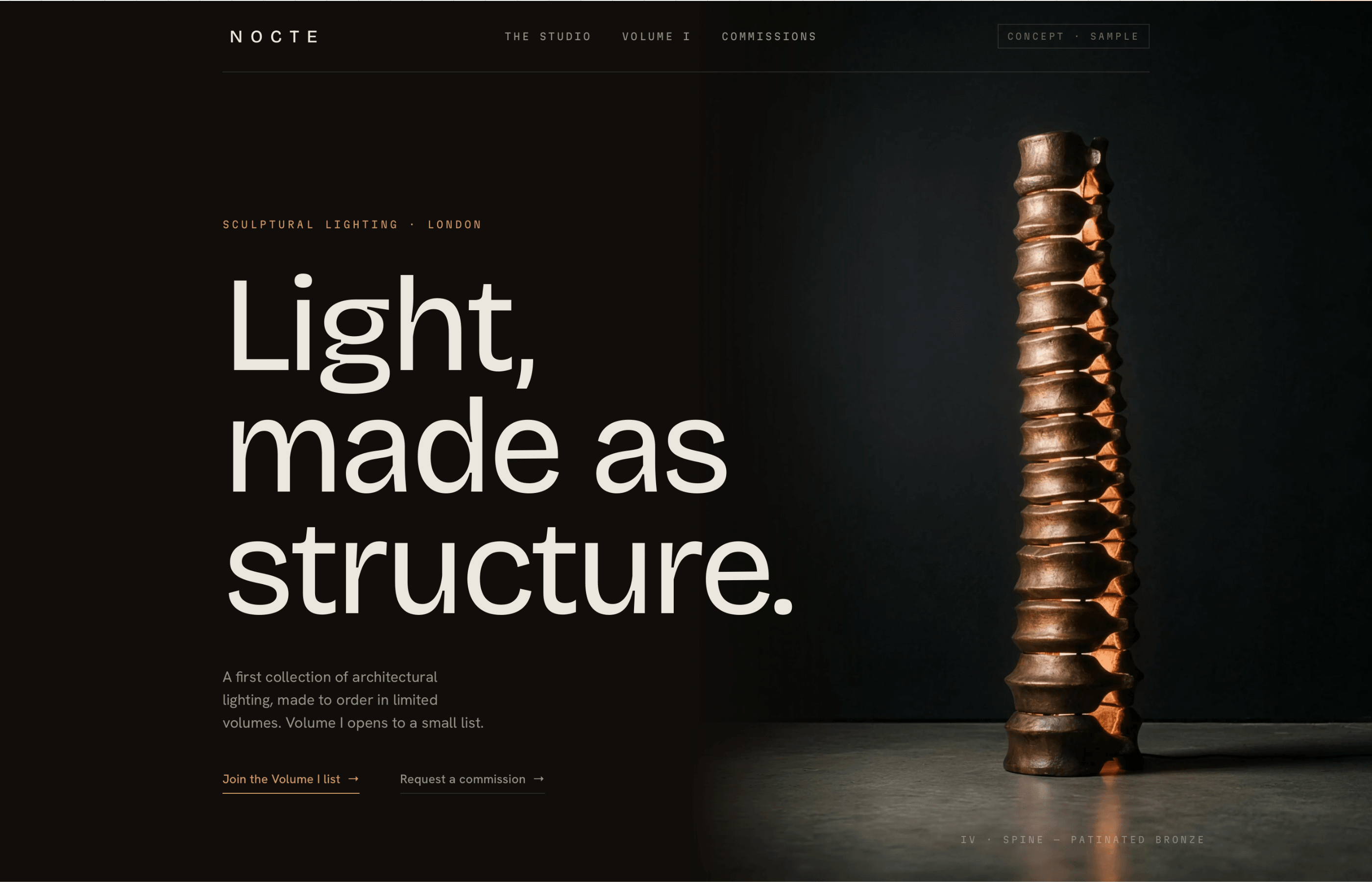
A commercially sharp landing page prototype with clear offer structure, visual direction and a working CTA/enquiry flow — built to show what conversion-focused design looks like for a real brand.
Brief
NOCTE needed a landing page that communicated their offer clearly, looked premium and converted the right visitors into enquiries — without relying on a bloated site or an unclear CTA.
What I built
A single-focus landing page with structured offer copy, visual direction and a working enquiry system. Every section earns its place: who it's for, what they get, why now, how to start.
Proof of
- Commercially clear landing pages
- Visual direction
- Offer structure
- CTA & enquiry logic
Most landing pages fail at the same point: they describe the product without addressing why the visitor should care. The fix is sequencing — lead with the problem, position the offer as the specific solution, then make the next step obvious.
Visual direction was built to feel premium without being cold — the brief was a brand that wants to attract clients who are discerning, not just wealthy. The two are different, and the design reflects that.
The enquiry flow was designed to qualify leads at the point of contact, not after. The form structure and supporting copy reduce noise and set the right expectations before a call is ever booked.
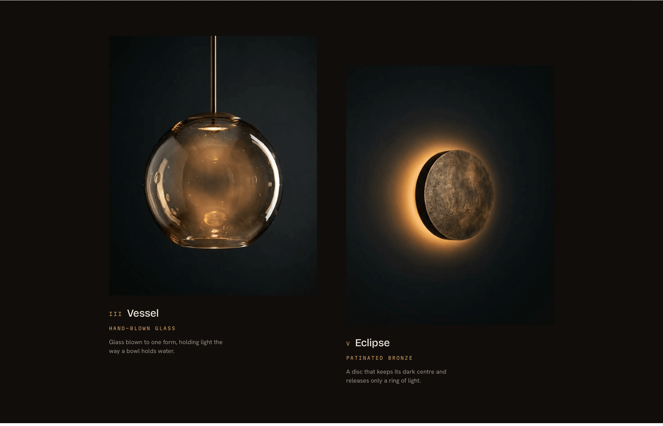
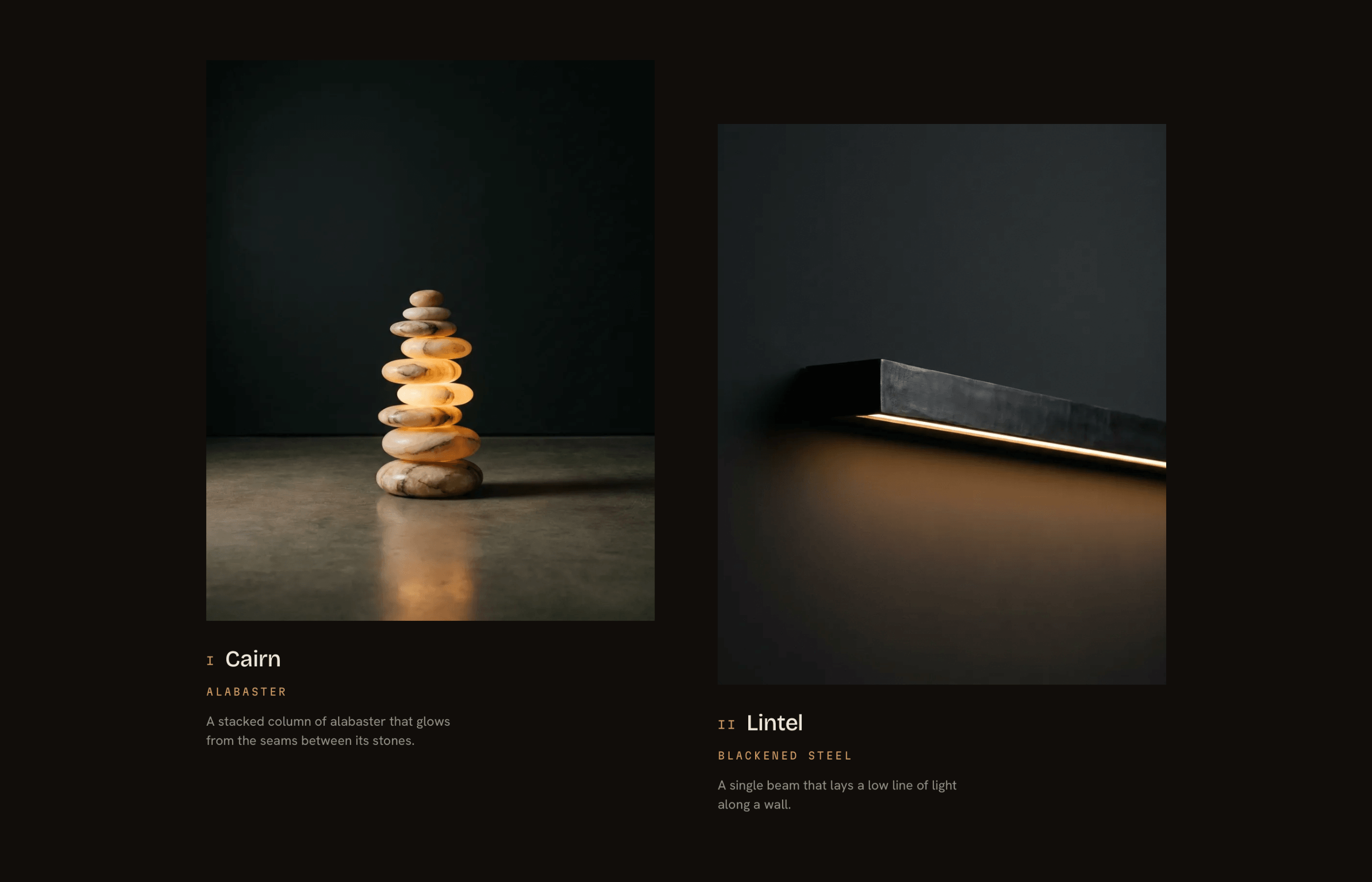
A working landing page prototype that demonstrates commercially effective design for service businesses. Clear offer, clear audience, clear next step — no ambiguity about what to do or why.